A new look and a better experience for Clariness
Clariness is a global clinical research provider. They approached MintTwist because their website had fallen behind their competition, and they needed our help with a complete rethink of their digital proposition.

Clariness chose MintTwist to help improve their site in every way possible
Embarking on a detailed planning process, MintTwist collaborated with with Clariness's marketing team to audit the existing site and look for new opportunities, improvements and efficiencies.
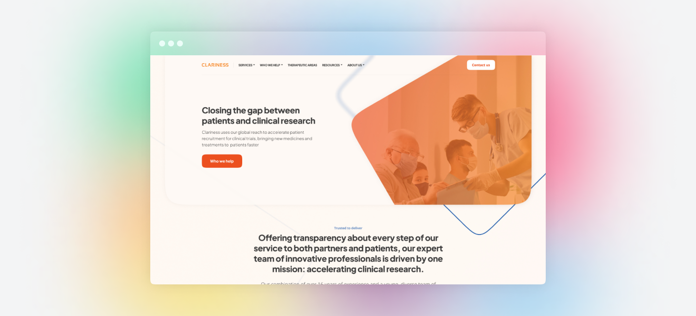
Armed with the results of our audit, we got to work on finding any opportunity for improvement in both the creative and the technology. We knew that Clariness’s site hadn’t had a significant update for many years and was looking dated, and the UX was cumbersome and slow, so we took our previous experience with other brands and built the improvements into the process from the outset. We took the time to shorten the distance visitors need to go in order to convert, either through a contact or by downloading some of the wide breadth of content available on the Clariness website.

A strong focus on optimizing every aspect of the user experience
MintTwist understood user habits and trends are ever evolving, so it was important that anything we build into the website enhances the experience
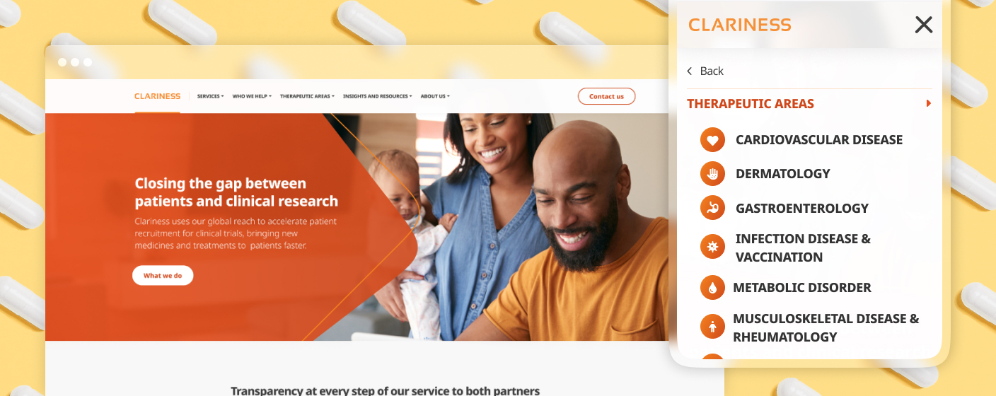
The old WordPress website was restrictive and clunky, and didn’t respond well to the needs of visitors.
Clariness had two distinct audiences, and we wanted to ensure that neither is sent down the wrong path to a conversion. We designed the calls to action slightly differently for each to allow for simple wayfinding and improved click-through rates.
Clariness’s users are increasingly mobile
Because of the nature of the audience and with the population ever on the move, mobile user experience was a top priority
It’s somewhat passé now to say that users are increasingly using the internet on their mobile devices, but it’s still important to note that time dedicated to a seamless mobile experience can increase the rate of conversion for any organization.
We knew that a high proportion of Clariness’s audience were using the site on their phones, so every detail was considered for mobile and touch devices before desktop. The new website design is fully responsive and there are unique optimizations woven throughout for both mobile and desktop devices, ensuring the user experience is efficient, friendly and enjoyable from first hit to purchase.
A seamless launch
We went live with Clariness’s new site without any issues, and it’s great to see the hard work of our teams pay off
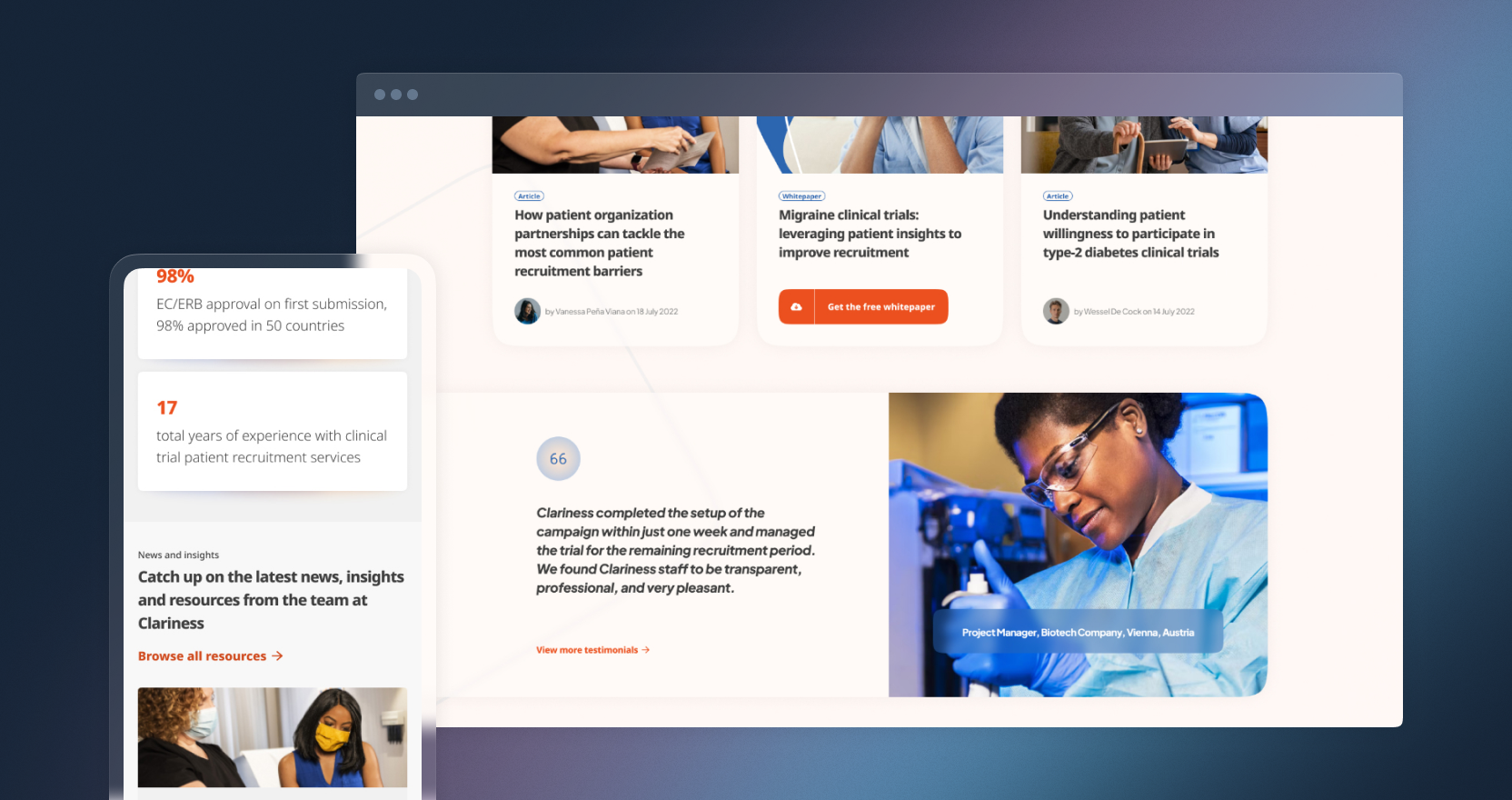
The new site is bedding in well, with all of the new functionality working as planned and an increase in both website traffic and conversions.
Whitepaper downloads are ticking up and user feedback has been positive. We’re proud of our work and we can’t wait to see how Clariness grows in the future, as an organic entity as well as with our help.
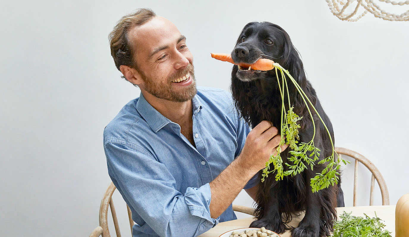
Ella & Co
Subscription ecommerce technology for a new dog food startup
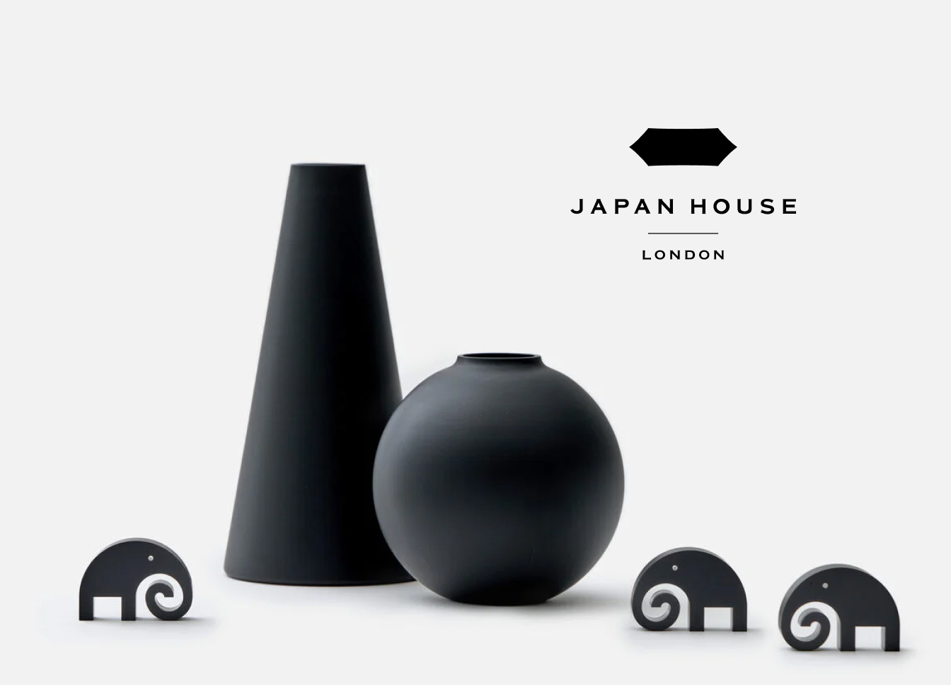
Japan House London
New ecommerce website for the Japanese cultural centre.