A brand new look and feel for Chubb Insurance
Chubb wanted their Digital Insurance microsite to be much more appealing to their target customers, so they asked us to completely revamp it.

The challenge
The website redesign needed to stay within the corporate brand guidelines, whilst pushing the boundary as far as we could.
The existing website was a collection of edits over a long period of time, which resulted in a distinct lack of direction and focus. Design elements had been pulled in from other areas of the website, so some of the elements didn’t make sense, the core messaging was being lost, and the calls to action were not clear. All in all, a bit of a mess.
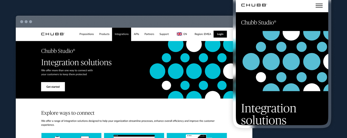
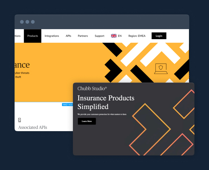

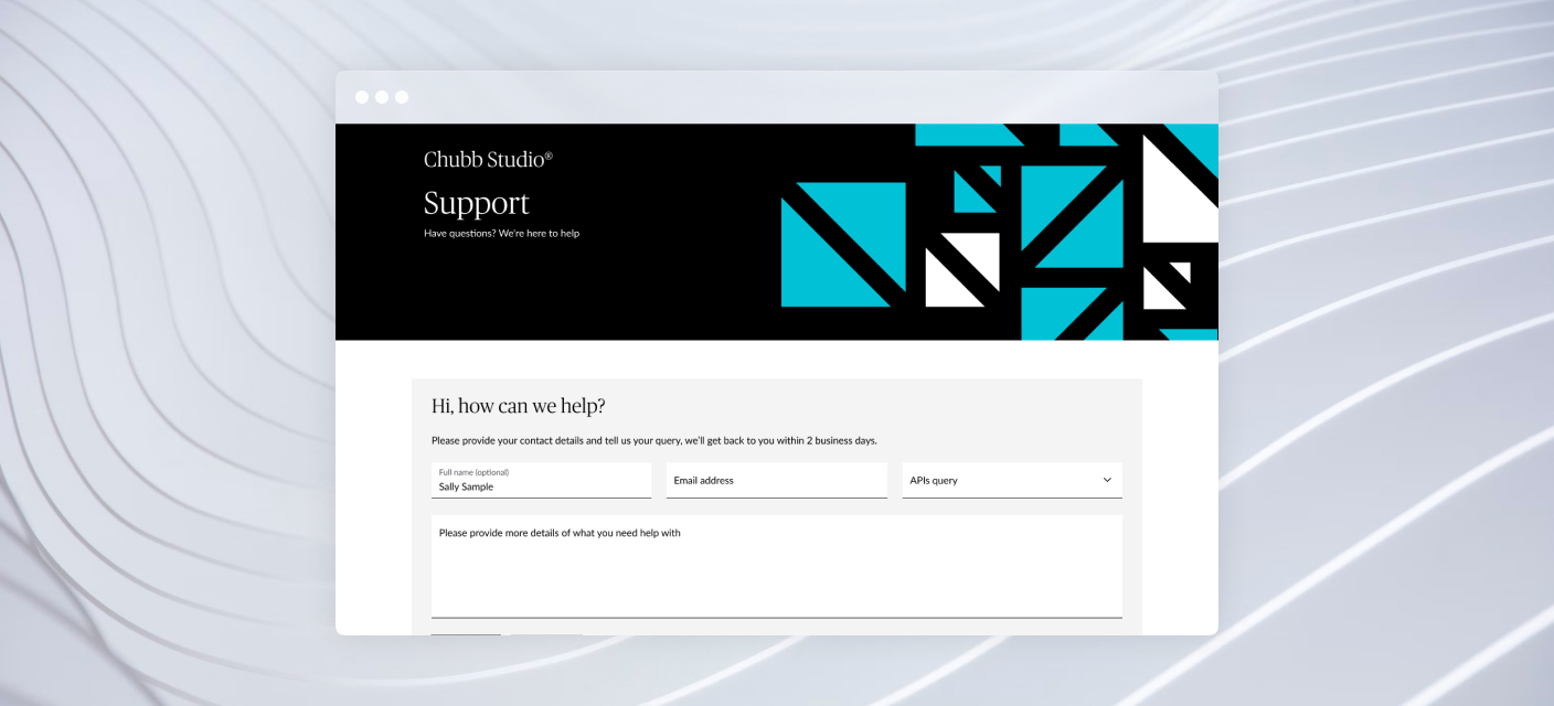
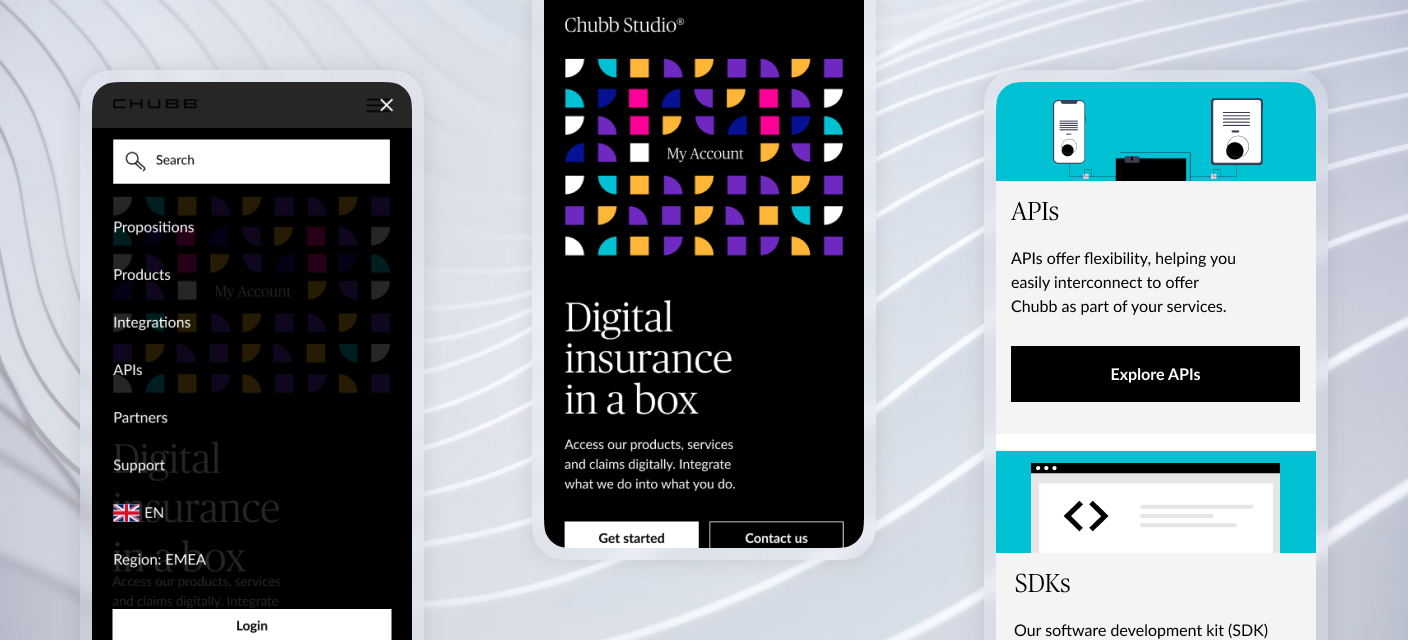
The solution
Introduction of interesting elements
We decided to focus on the brighter colours in the brand book to allow us to bring much-needed interest to the pages. Combining this with the new graphical elements and a much-improved page layout has led to a much more organised, lighter feel to the pages. With the stand-out calls to action, the pages now feel much more connected to the Digital Insurance product they are promoting.
The result
A site that feels much more modern and engaging
Chubb is already seeing the benefit of the new layout and design, with all key metrics significantly up. An increase to page views and time on site, along with a reduction in bounce rates, have led to increased enquiry volumes.
Japan House London
New ecommerce website for the Japanese cultural centre.

Planet Watchers SEO
Using SEO to help PlanetWatchers promote their startup on search.