The problem with flat design as an argument against skeuomorphism
Flat website design has been gaining traction in recent months, and whilst it is a refreshing change and, of course, …

Flat website design has been gaining traction in recent months, and whilst it is a refreshing change and, of course, a legitimate design technique, it does have some problems.
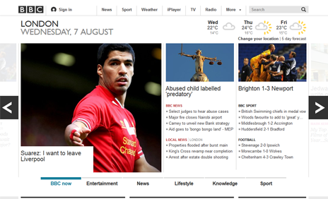
The BBC was one of the early pioneers of flat web design
Few of these problems are in the technique itself, but in how the technique is executed, and indeed how it is defined. The terms itself is, in my view, the first major issue. As soon as any kind of method or technique is given a name—pigeon-holed—it is immediately en-vogue. Flat design has become a trend.
But flat design has always existed; it just wasn’t called flat design. It wasn’t called anything. But now it’s used as a marketing term, a way to sell a particular method to clients and board members, when a method shouldn’t be sold. A method is a tool; a means to an end. It is the end that is being bought.
Flat design is being used as a weapon in the fight against skeuomorphism
It’s a lot like the emergence of responsive web design and cloud computing. Websites have always been, to a large degree, responsive. And isn’t ‘cloud computing’ just a fancy name for, uh, the Internet?
What exactly is flat design?
- Minimalism
A flat design should strip away all of the excess baggage, the stuff that doesn’t really add anything to the user experience - Usability
Websites and systems designed without excess baggage are supposed to emphasise usability. I.e. they should be easier to use - Bold
Flat design uses simpler and cleaner tools to emphasise key parts of a page or screen, such as bolder colours and typography - Simplicity
The message is easier to grasp if there is less detail, less ‘stuff’ to wade through in order to find ‘The Point’
The execution of flat design
For me, this is where the whole system just falls over. Significant periods (for want of a better word, ‘trends’) in the design industry, particularly web and software design, occur on a monthly basis, but there are always those that stand out as particularly profound. The zeitgeist over the last few years has definitely revolved around skeuomorphism.
And it is partly skeuomorphism that has caused this massive shift towards simpler, less cluttered, flatter designs. Flat design is being used as a weapon in the ‘fight’ against skeuomorphism. And that, in my opinion is rather unfortunate, because it doesn’t allow flat design its due credit.
Flat design is a principle that cannot be defined by what the end product looks like
Of course every design technique has its pros and cons, but when we use a particular method because it’s something different, without actually understanding the methodology behind it, the argument for it is lost. You cannot justify your decision to use a particular technique simply by saying “it’s something different.”
When you don’t understand the true benefits of flat design, you end up executing it in a way that is less usable for the end user, and therefore goes against everything it stands for.
The same could be said for Apple’s use of skeuomorphism. Of course skeuomorphism has its benefits, but Apple’s over use of the technique became sickly and outdated, and others showed it up to be outmoded in the case of iOS and OS X.
What to remember about flat design
Flat design is not a weapon against skeuomorphism or anything else. It is a technique in its own right, and can be used alongside other techniques to great effect.
Problems arise when designers flatten an entire web page, making it difficult to discern what is a call to action, what is navigation, what is the key content. Information architecture is lost, and the page is undecipherable and unusable.
Flat design is not the total elimination of gradients and rounded corners and box shadows and textures and patterns. Flat design is a principle; it cannot be defined by what the end product looks like. Great examples of the use of flat design as a complementary piece of a suite of design methods are Google’s web apps.
Apple’s tacky skeuomorphs haven’t aged well
Google’s design of user interfaces has come a long way in the recent past. You need look no further than their Gmail web interface to analyse some of their methods. It uses simple iconography, as opposed to detailed illustrations. Typography is consistent and well-spaced. And look, they’ve used a gradient on the key call to action.
It’s a subtle, almost un-noticeable gradient, but it’s there. It also has slightly rounded corners.
And that’s the key, here, isn’t it? That gradient is used in such a way as to make the main call to action stand out. The rounded corners are a subtle skeuomorph. This button is easy to find, no matter how cacophonous your inbox. And, hey, it’s clickable, because it just looks like a button.
Google has used rounded corners and a gradient under the principles of ‘flat design’.
If more designers thought about the people using the end product than following trends, not only would the designers be doing their job successfully, but the users might actually get enjoyment out of using the product.
It’s about the little things coming together to form the big picture.
Think about the car manufacturer not only perfecting the usual things, like the gearbox and steering response, but the small details such as the satisfying ‘clunk’ the door makes when you close it, or welcome glow of the dashboard as you unlock the car.
The devil’s in the micro interaction.
More insights from the team


