Do Musicians Even Need Websites Anymore?
The way we access music these days is completely fragmented and different for everyone, with music discovery moving away from …

The way we access music these days is completely fragmented and different for everyone, with music discovery moving away from musicians’ websites and onto social networks .
When was the last time you consulted your favourite band’s website to find out the latest updates?
Chances are it was months ago, if at all.
We will try to find some answers by analysing how – arguably one of the biggest live acts – U2 has evolved the use of their website design to support its music and push their brand forward.
This may come as a surprise to some, especially those iTunes users who nearly turned into an angry mob.
This piece will focus on the design and functionalities choices taken by U2 on their website, rather than on its more technical aspects (as the site’s loading speed, image, the script and HTML loading times, etc). MintTwist have experience designing, here you can find a flavour of our work.
Website Design – The evolution
2006
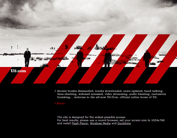
In 2006, their pre-homepage (see above) displayed a description of what fans could expect from their website – all introduced by a catchy, and self-referential Atomic Bomb Dismantled.
Following the trend of the mid-2000s, images were an extremely prominent part of each website. This was also the time when JavaScript allowed adding intelligence to pages’ layout, without the use of Flash.
The actual website would allow fans to subscribe to access exclusive content, latest news, upcoming gigs etc.
Oh, and If you thought the symbol to the left of “Atomic” was a hashtag, you are mistaken – exactly like me. Back in 2006 Social networks like Twitter and Facebook had not conquered the mainstream slice of the market.
The use of white colour for the main font allows for quick reading with the red colour call to action to grab attention.
2008
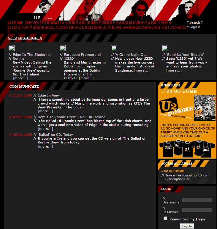
One year later and the U2 website design would become more minimalist. By early adopting the principles of gamification (the application of game-design elements), the websites user experience increased tenfold. The layout also takes inspiration from forums, which were extremely popular back then.
The site started to utilise icons strategically and developed a colourway which was similar to the group’s album covers and marketing collateral.
It is also interesting to note the space they had dedicated to the call-to-action to their membership subscription.
2010
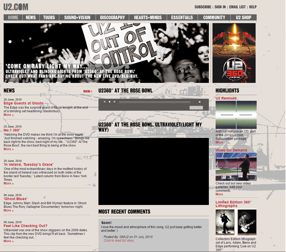
This iteration of the U2 website can also be defined as a transitional one: it contains navigation bars and drop-down menus but also live updates around user generated content in the bottom right corner i.e. latest fan photo.
The website was slow to integrate social media into the site, this may have prevented the band from accessing new audiences around this time.
The website was content-heavy, with a layout that made it difficult for the user digest. Here the website is much larger in size and has a lot more elements to play with, using background imagery to keep attention.
2011
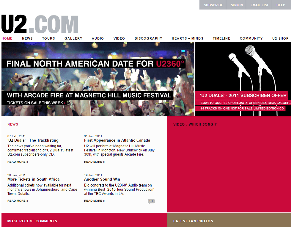
In this design, we see the website moving to a rather simplified version, with clear section breaks, using background colours behind the text to maximise engagement.
2013
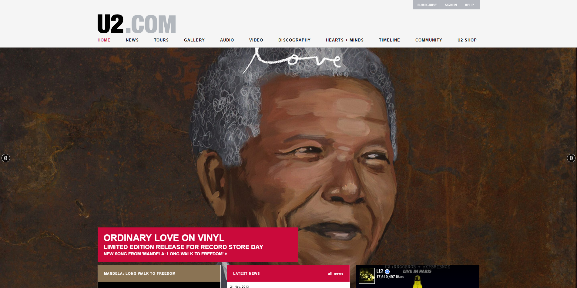
The website design became crisp and minimalist with less noise and better use of wide-open spaces. This iteration is also the first one which incorporates social media (finally).
2014
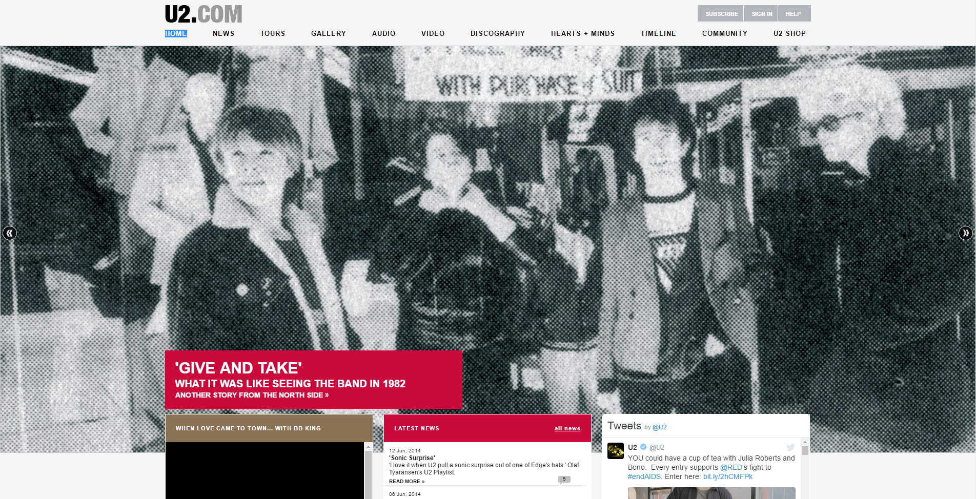
The website has a similar look to the previous version but here we see a more current feel and look, using opacity on layers to show the image behind the text.
2015
With the use of some clever opacity, the website design keeps its offering clear but also puts the user into a scene of a live show.
2016

This update takes further the principles of gamification and completely abandons the prior sales approach. The new website is geared towards extending the user’s affinity with the brand, rather than carelessly blasting them with information. It is also clear that the company has put a greater emphasis on SEO (search engine optimisation) from the sites page layout, hierarchy and internal linking. Their website is now responsive and mobile optimised too.
User experience is undoubtedly the key success factor of any modern website, giving way to such design features as infinite scrolling and single-page design, while U2 are still adopting the slightly older approach of a “sliding” background.
Be bold
U2 have been bold enough to innovate across the whole spectrum of digital during their career, but when it comes to smaller up-and-coming acts, the original question is still very current – so what is our answer at MintTwist? We do think that a well-designed, modern and user-friendly website still provides any act with a competitive advantage and gives an important branding orientation, especially if supported by a well thought-out digital strategy.
Websites are not the first place where people discover music, buy music or read news about their idols; there are plenty of other apps serving these purposes, like SoundCloud, Mixcloud, Songkick, Spotify, not to mention Facebook and the other social networks.
As we know, innovation comes with risks, but at MintTwist we are fully aware of what it takes to build a great website – from the design to the development bit – which is still a relevant milestone in every business’ digital presence, regardless the industry.
One of the reasons why U2 managed to appeal to newer generations lies also in the fact that they decided to embrace digital and take the risk to innovate (the partnerships with Apple and YouTube are good examples), and this is a principle we advise our clients to follow.
Should you want to take your digital knowledge to the next level, you can attend one of our complimentary workshops or simply get in touch.
MintTwist provides social media expertise, content marketing experience, plus design and web development services. If you have a project in mind, get in touch today.
More insights from the team


