How to increase sales with a user-friendly website
Designing for the user is not as easy as it seems. Many companies or agencies often overlook its importance, creating …

Designing for the user is not as easy as it seems. Many companies or agencies often overlook its importance, creating beautiful websites, without thinking how the user will browse through it.
Designers themselves tend to make the same mistake, focusing on aesthetics and forgetting about the user experience. At the end of day, what sells is the website’s appearance, right? Wrong! The design is very important because will be the first impression that the user has of your company, but what converts the sale is usability.
So, how can you improve the usability of your website?
First of all, look at any analytics data you have and see how the users move from one page to another. You can see it in the visitors’ flow in Google Analytics.
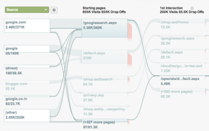
If you see that users often bounce back and forth from one page to another, or they go to the home page in order to search for another section instead of directly visiting from their current page, there must be something broken and it may mean that they get lost.
Another way to identify problems or simply to increase the conversion rate is by improving the usability with Conversion Funnel, like the one displayed below:
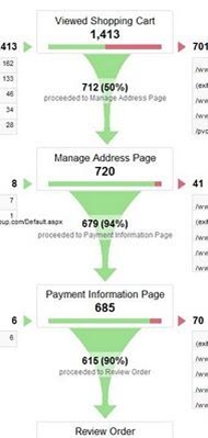
Here you can see how many people drop in each stage of the process and think about ways to improve the checkout process in order to make it easier for the user. How many times have you reached a check-out page only to be confronted by a never-ending form to fill? Did you continue with your purchase or find another website to buy from? These are issues that you should consider for your own website.
The best thing about online marketing and e-commerce is that you can try things and get results within a few hours. With A/B testing you can decide which one is working best for your site very quickly.
What to look at in the checkout process
Here I will give you some best practises that will help you make the checkout process quicker and easier for your customers:
- Forms and fields: it is easy to ask users for more information than what is really needed. It usually leads to users getting bored or thinking about why they should provide that information if it is not needed. So, think exactly how many things are really important and remove the rest or mark them as optional. If there are any specific fields that have no obvious reason for you to require it, explain the reasons in the description of the field
- Filling in the data: it is very important to get right the mix of buttons, drop downs and fields that you use in forms in order to make the process smooth. There are many different kinds of buttons and fields that depend on the kind of information such as check-boxes, radio buttons or calendars. Think about the characteristics of each one and whether it’s best to use a particular one for each field
- Always use a checkout progress bar, to indicate to the customer how many steps are left to finish. This is very important as users might feel discouraged if they are not sure how long they have left. Letting them know how close they are to the end will encourage them to continue
There is much more to usability and conversion rate optimisation than just these few tips. It is a very extensive area of web design that is usually overlooked. As mentioned before, it can help to generate huge increases in revenue once implemented.
MintTwist, can help you increase your online sales by creating a beautiful and user friendly websites that will contribute to growing your business online. Don’t hesitate to contact us at hello@minttwist.com or tweet us @MintTwist.
More insights from the team


